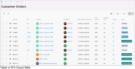
IFS Cloud Web facilitates the usage of tables to display details easily.
Using Tables
In IFS Cloud web, you will come across tables on pages that show an overview
or details. These tables allow you to handle multiple records simultaneously.
They are also present in master-detail pages, which have a header and rows,
similar to the Customer Order page.
Note: You can customize the order, size,
and visibility of columns in these tables. The columns can be read-only,
editable, or locked for editing. Some pages let you edit existing records or
create new ones, especially those dealing with basic data. For more complex
data, you'll often use detail pages or master/detail pages.
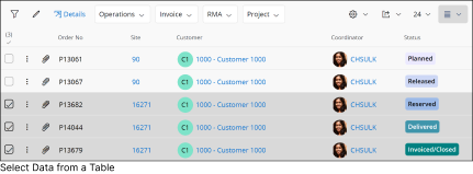
Selection Of Data
Tables within IFS Cloud offer multiple data selection options, allowing you to combine mouse controls with keyboard shortcuts. This feature enables quicker and more convenient selection of your preferred data.
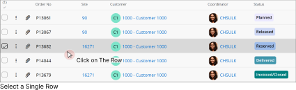
Select a Single Row
To exclusively select a specific row, simply Click anywhere within the row or click the Check Box.
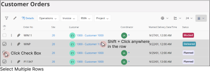
Select Multiple Rows
To select multiple rows, Click the
Check Box next to each row and Shift + Click anywhere in another row.
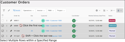
Select Any Number of Rows Between Two Selected Rows
To select all the rows inbetween two rows:
Click anywhere in the first row.
Hold down the Shift key and click on the last row in the range.
This will select all the rows between the first and last rows you clicked on.
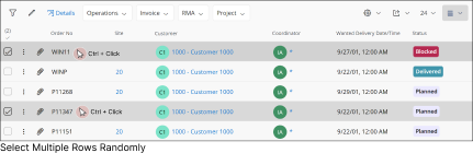
Randomly Select Multiple Rows Dispresed Through the Table
To select multiple rows dispersed throughout the table
Hold down the Ctrl button and Click any
where on each desired row.
Or
Click the Check Box next to each
desired row
Note:
After selecting a row, you'll be able to view and use all the allowed controls specific to that row. These controls will be accessible in the command bar.
If you select multiple rows in the table, you'll only see the common controls that are shared among those selected rows in the command bar.
General Functionalities
The specific actions you can perform within a table are determined by your system privileges. Below are some of the common tasks you can execute within a table in IFS Cloud Web.
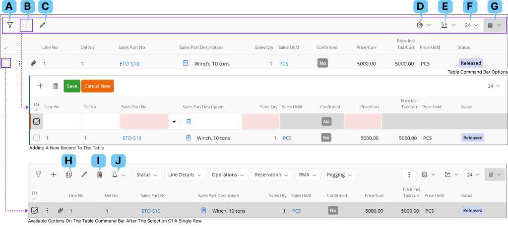
A: Filter Search
You can filter the records within a page by using the Filter Search option. Please follow the guidelines in
Filter Search Pane to filter the records.
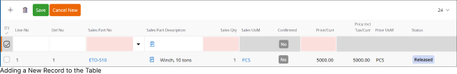
B: Add Record
Some tables in IFS Cloud allows you to add new records manually. If the table permits
creation of a new record, you can find the Add New Record button at the top of the tables
To create a new record:
Click Add New Record button or use Alt +N Keyboard Shortcut.
By doing this, a new record field will appear within the table, as demonstrated. You'll need to complete information for each new column based on the field type, as explained in
Using Text Fields section.
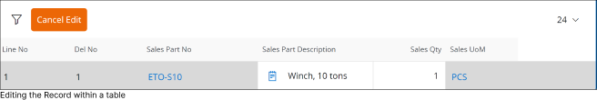
C: Edit a Record
If the table permits you to edit an existing record. Click on the Edit a Record button to edit the selected record in the table.
Once you click the edit button it will enable the edit mode for the record.
When editing the record:
You will be able to modify information in each column based on the field type, as explained in Using Text Fields section.
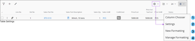
D : Table Settings
Table Settings enable you to configure the appearance and how you add data to the table.
It consists of four main configuration options as shown in the diagram
below.
Column Chooser
Allows you to modify the arrangement of table columns and add or remove columns from the table as needed. Upon selecting Column Chooser,
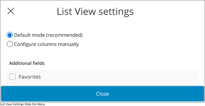
you will be prompted with the List View Settings slide-out menu, where you can configure the table columns.
1.
Default Mode (Recommended)
Only the default columns selected by the admin will be displayed in the table.
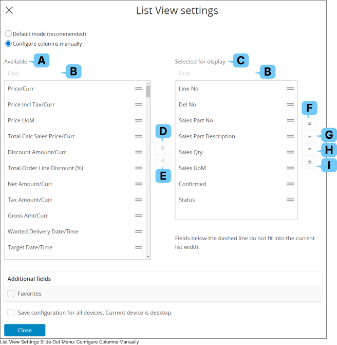
Configure columns manually
Use Column Chooser Interface to:
Add new columns to the table.
Remove unwanted columns from the table.
Change the arrangement of the columns.
Additional Fields
Add a new Favorites Column to the table. You can use this column to effortlessly mark your preferred records as favorites.
This section displays all the available columns in the database, you can add any column to the table by selecting a column name from this section and moving it to Selected for Display(C) section.
B: Find
Use this option to find a column from Available Columns(A) section or Selected for Display(C) section.
C: Selected For Display (Section)
This section displays all the columns visible in the table, you can remove columns from the table by selecting any column name from this section and moving it to Available Columns(C) section.
D : Move to "Selected for display”
You can use this button to move any column name from Available(A) section to Selected for Display(C) section.
E : Move to “Available”
You can use this button to move any column name from Selected for Display(C) section to Available(A) section.
F : Position The Column as First Column of the Table.
Use this button to set any visible column of the table as the first column.
G : Move One Position to the Left
Use this button to shift the selected column one position to the left from its current placement.
H : Move One Position to the Right
Use this button to shift the selected column one position to the right from its current placement.
I : Position The Column as Last Column of the Table.
Use this button to set any visible column of the table as the last column.
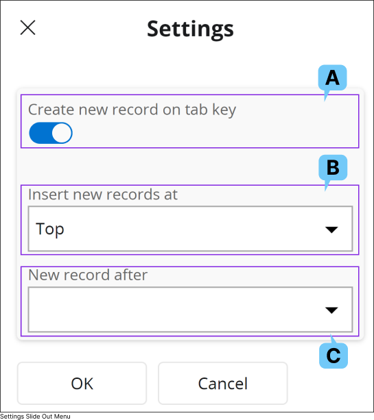
Settings
Settings allows you to customize the way you interact with a list or a table in IFS Cloud.
2.
A: Create new record on tab key
Utilize this functionality to enable the creation of a new record using the Tab key. This streamlines the process of adding new records by reducing the need for mouse clicks and allowing the Tab key to initiate the new record creation action.
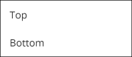
B: Insert new records at
If you've activated the new record creation functionality using the Tab key, utilize this drop-down menu to select whether to add new records at the top or bottom of the table/list.
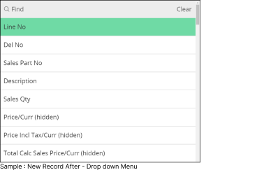
C: New record after
If you've activated the new record creation functionality using the Tab key, utilize this drop-down menu to select which column should initiate the creation of a new record once you tab out from it.
Example: If you have a table with seven columns named as Column 1, Column 2,..., Column 7, and you select Column 5 from the drop-down, pressing the Tab key at Column 5 while adding a record will initiate the new record creation action. This will create a new row for you to enter data.
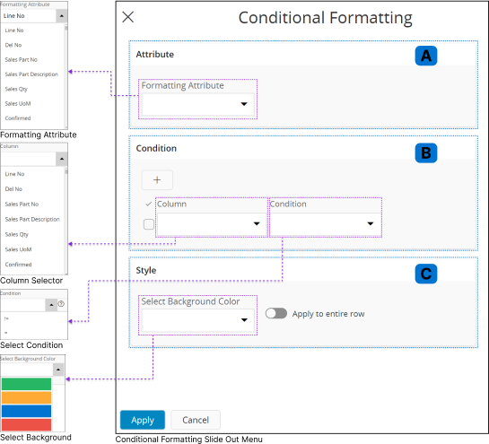
New Formatting
When you click the New Formatting button, the Conditional Formatting slide-out menu will appear. This menu allows you to set conditions for the table data.
If any record in the table meets these conditions, it will be displayed according to the specified formatting rules.
3.
A : Attribute Section
The Formatting Attribute drop-down menu in this section lists all the table columns. You can choose the column where you want to apply a conditional format.
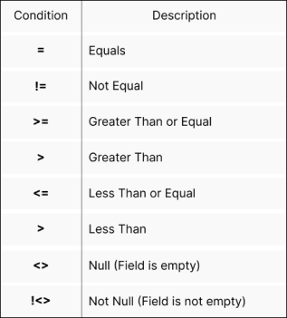
B : Condition Section
In this section, you can set conditions based on the cell values in the table columns. When a cell value meets any of the defined conditions, the specified formatting will be applied to the selected column in the
Attribute Section(A).
Select a column you wish to apply a condition from the Column
dropdown menu.
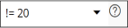
Add any one of the following conditions from the Condition dropdown menu, and then type the conditional value after
the condition.
Example :
If you want to add more conditions, click the plus sign, and include another condition in the Condition Section(B). Follow the same steps to define the new condition.
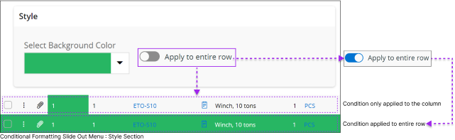
C : Style
You can choose a style to apply to a column's cell when the defined conditions are met by selecting a background color from the Select Background Color drop-down menu.
You can also use the Apply to entire row slider to apply the Background Color to the entire row
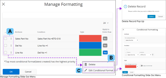
Manage Formatting
You can manage all the conditions you have created for the table by using Manage Formatting option.
4.
Click on the Check Box(A) or 3 Dot Menu(A) to edit the conditional formatting configurations you have created.
If you wish to delete a condition, click on Delete(B) button and confirm your action by selecting Delete in the Pop-up message.
If you wish to edit your existing condition click on Edit Conditional Format (C) button and follow the same steps in Conditional Formatting (2) section to edit your current condition.
Adding Conditional Formating to Date-time Formats
IFS Cloud enables you to apply conditional formatting to date-time fields based on the type of page. Depending on the page's architecture,
there are three different ways to add conditional formatting for date-time data.
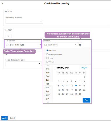
Time zone drop-down menu is not available
1.
Some list pages in IFS Cloud include
conditional formatting behaviour that does not
provide the capability to apply conditions to table rows based on different time zones.
On these pages, you can only select a date-time value, and the conditional formatting will apply to the date-time values in your working time zone.
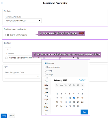
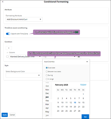
Toggle Button is available to enable time zone drop-down menu
2.
Another type of list page in IFS Cloud includes a section called 'Time Zone Aware Conditioning.' This section features a toggle button that, when activated,
displays a drop-down menu for each date-time value selected under the Condition section.
Users can use this menu to choose different time zones when setting conditions,
allowing them to apply conditional formatting to date-time values from multiple time zones.
If you wish to highlight date-time values based on a different time zone other than your working time zone,
you can enable this toggle button and select the appropriate time zone before applying your condition.
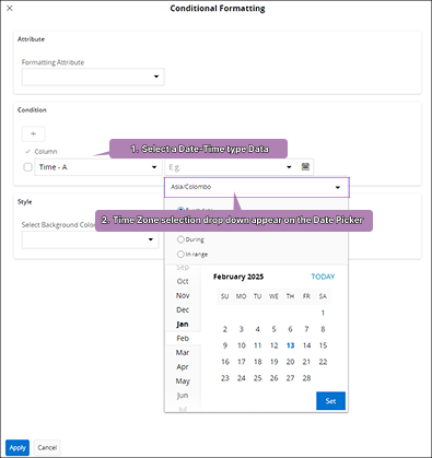
Toggle Button is not available but a time zone drop-down menu is available
3.
This type of list pages will have
time zone drop down menu appear
automatically on a date picker when
you select a date-time data type
from the Condition
section.
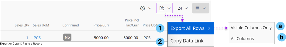
E : Export or Copy and Paste a Record
Some tables within IFS Cloud allows you to export the data in the table to an Excel workbook or copy the link to the OData server call and share it with your coworkers to demonstrate your current table view.
1 : Export All Rows
If you wish to export the data in the table to an Excel work book, click on Export All Rows(1) button and select one of the following options from the menu:
Visible Columns Only(a) : You can export the columns which are in you current view to Excel work book.
All Columns(b) : You can export all the columns in the table to Excel work book.
2 : Copy Data Link Choose this option if you wish to copy the link to the table for sharing.
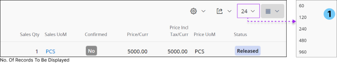
F : Number of Records to be Shown
If the table you're working with contains an extensive number of records, and you prefer to initially visualize a predefined number of records, you can make use of this feature.
1 : Number Of Records
Click on the Number of Records(A) drop down menu and select any value from it.
Example: In the diagram provided, you have the flexibility to choose from values such as 60, 120, 240, 480, and 960.
The table will then display the specified number of records initially based on your selection.
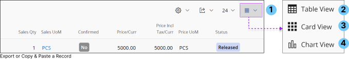
G : Table View Modes
Tables in IFS Cloud supports four main types of view modes. Depending on the configuration, the number of view modes
supported by the table may vary.
List View
List view provides a holistic representation of multiple records in a table format without a horizontal scroll or grid lines.
The displayed information seamlessly adjusts to the specific device in use or the view span of your browser window.
1.
If a user chooses to hide columns, additional columns will become visible to accommodate the available display space.
It's important to note that the`display prioritizes fields set by design (although these can be altered in the view settings).
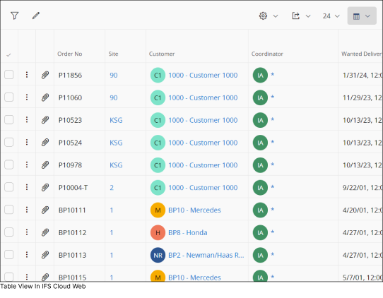
Table View
A specific view showcases multiple records with both horizontal and vertical scroll enabled. Additionally table view provides you with the following features:
2.
You have the option to freeze or fix a column, ensuring that specific information remains visible even when scrolling horizontally.
You have the flexibility to manually adjust the column width to accommodate more columns within your viewing area.
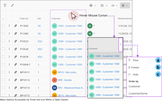
Table View - Options
When you hover over any column, you will be able to view the 3 Dotted Menu Button.
Click on the 3 Dot Menu Button to view the options
a : Filter
You can utilize the Filter option to filter column values. Once the filter is applied, you will only see rows containing data applicable to that specific filter.
b : Freeze
Enable the freeze option to lock a column in place within the table.
When you scroll horizontally left or right, any column to the left of the frozen column will remain fixed, while all columns to the right will move horizontally.
c : Hide
You can use this option to remove a column from visibility in the table
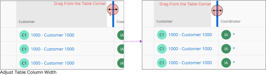
Adjust Table Column Width
In the table view, you have the flexibility to manually adjust the width of any column.
Simply enable the table view, hover your cursor over the margin of the table, and when the cursor changes to a double-ended arrow, drag the table margin to your desired width.
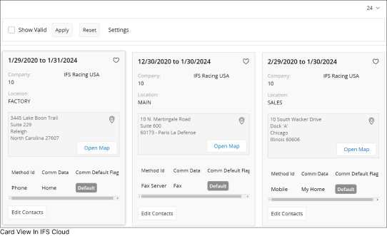
Card View
Card view provides a visual representation to data within a table by displaying it within information cards.
3.
Enabling Card View allows you to visually grasp most details about a record through a graphical representation.
Note:
While you can choose multiple records in table view and list view, card view does not support the selection of multiple records.
Card view also does not support Duplicate Record(H),Delete Record(I) or Subscription / Notification(J) options in the controls
Chart View
4.
H : Duplicate a Record
If the table permits you to duplicate the existing records. Click on the record you wish to duplicate and click the Duplicate Record button to create a duplicate of the selected record in the table.
I : Delete a Record
If the table permits you to delete records, select the record you wish to delete and click on the Delete Record button to delete the selected record in the table.
J : Subscriptions / Notifications
You have the option to subscribe to a record field or create a task for a record in a table using the
Subscriptions/Notifications feature. Refer to the Tasks section for task-related details
and the Subscription section for
subscription-related instructions.
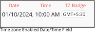
Time Zone Supported Date/Time Fields in Tables
Some date/time fields
in IFS Cloud tables provide time zone support. When the system capture date/time values from different time zones,
it will be displayed in the table along with a time zone badge next to the
date/time value.
Go to Entering Information in IFS Cloud Web:
Using Date & Time Fields to
learn more about date/time fields.
Note: If your current working time zone matches the time zone set for the
date/time field, time zone badge will not be displayed alongside the field.
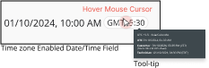
When you hover your mouse cursor over the time zone badge, a tooltip will
appear, providing additional information related to different time zones. The
content displayed within the tooltip is determined by your system administrator.
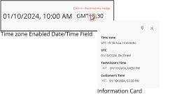
When you click the time zone badge, an information card will appear,
displaying information determined by your system administrator.
Keyboard Shortcuts
The table below provides the keyboard shortcuts associated with tables:
Shortcut Key
Description
To move focus to another column
or row.
To move focus to next column and
enable cell editing.
To move focus to previous column and enable
cell editing.
To toggle cell editing.
To access the contact widget and links in a
cell (in view mode).
The table below provides the keyboard shortcuts associated with tables
for List of Values:
Shortcut Key
Description
To open the List of Values menu
(when cell editing is enabled).
To select an item from the List
of Values menu.
To close the List of Values menu without
changing the current value.